
Limewire
About
In the early 2000’s Limewire was a free peer-to-peer file sharing software that allowed users everywhere to upload and download everything from movies, music, games, and software. If it could be pirated, it was on Limewire. And if you were on the computer from 2000 to 2010, chances are you remember what I’m talking about.
Limewire holds a special place in my heart. It’s where I fell in love with comedy by downloading early Chappelle and Chris Rock specials, where I saw influential movies like Akira and Ghost in a Shell, and learned about graphic design by downloading Gimp (a photoshop knockoff) in High School. Which is why I decided to take this piece of internet nostalgia, and tried to imagine it alive and thriving in 2020.
What I Did:
Branding
Product Design
UX/UI
Iconography
The Challenge
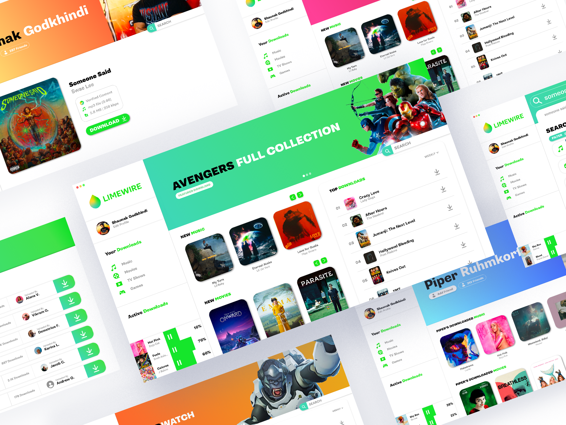
Limewire never had a consistent look. Because of it’s legally ambiguous nature, things got shut down and re-opened quite often. This led to it’s user experience to be very ambiguous and not very intuitive. Things changed drastically between versions with no explanation and you often had to relearn the software.
The interfaces you’d deal with as a patron were often drab, text-heavy, and monotonous. It should have felt fun! You were illegally downloading your favorite movies, the new Jay-Z album, and Halo on your parents’ work computer.
My Approach
To clear up the previously opaque user experience I decided to bring in familiar pieces from software the average user already interacts with on a daily basis. Featured content, a weekly top downloads list, newly uploaded content, and a simple profile system mirror experiences we have using Spotify, iTunes, and social media. This along with useful employment of plenty of white space, sectioned out elements, and pops of color, allows any new user to take one look at a given screen and figure out what they’re being prompted to do, what they want to do, and how to go do it.
To create excitement and a sense of joy while using Limewire I injected way more color, imagery, and modernity than was found in previous versions. Artwork, bright pops of color, and bold text helps the user feel like they’re engaging with their favorite pieces of media. Social features like profiles keep the experience light, and allows users to express themselves.
This project was a lot of fun, and if you want the XD file I built it in, I’ll send you the Limewire link! Thanks!
BEFORE


AFTER


WIREFRAMES

LIMEWIRE

HOMEPAGE

SEARCHING

USER PROFILES

SCREENS


